Learn to Create Dynamic Infographics Using Adobe Illustrator: Step-by-Step Tutorial

 May 2, 2025

 IsabellaDavis

 5
5
If you're diving into the world of infographics, you're on the right track to make complex data look not just understandable but downright fascinating. And when it comes to crafting these visual masterpieces, Adobe Illustrator is your best bet. This guide is your roadmap to creating infographics that not only catch the eye but also communicate your data effectively, leaving your audience both informed and engaged. Let's be honest, infographics are a must-have for anyone serious about data visualization, and Illustrator? It's the cream of the crop.
Key Points to Master
- Get a grip on the fundamentals of infographic design with Adobe Illustrator.
- Learn to craft layouts that are both visually appealing and chock-full of information.
- Harness the power of vector graphics for scalability and top-notch visuals.
- Incorporate charts and graphs to make your data pop.
- Enhance your infographic with icons and images to boost understanding.
- Master the art of color schemes to create a unified and impactful design.
- Discover how to export and share your infographic to reach the widest audience possible.
Getting Started with Infographic Design in Adobe Illustrator
The Power of Infographics
In a world where we're bombarded with information, grabbing attention is no small feat. That's where infographics shine, cutting through the clutter with a mix of text, images, and data visualizations that tell a compelling story. Whether you're in business, education, or marketing, infographics are your secret weapon to convey complex ideas, highlight stats, and engage your audience. And mastering them in Adobe Illustrator? That's going to elevate your skills to new heights.
But remember, infographics aren't just about looking good. They're about clarity, efficiency, and making an impact. A well-crafted infographic can:
- Boost your website's traffic by being shareable on social media.
- Strengthen your brand's presence with consistent branding.
- Increase engagement with content that's more likely to be viewed and shared.
- Simplify complex data into digestible visuals.
- Position you as a thought leader by showcasing your expertise visually.
Setting Up Your Workspace
Before you jump into designing, setting up your Adobe Illustrator workspace is key. It's all about making your workflow smoother and boosting productivity. Here's how to do it:
- Create a New Document:
- Launch Adobe Illustrator.
- Go to File > New.
- Choose a size that suits your needs, like 800 x 2000 or 1000 x 3000 pixels. You can tweak this later.
- Set the color mode to RGB for web or CMYK for print.
- Click 'Create'.
- Customize Your Panels:
- You'll need panels like Layers, Properties, Appearance, Color, and Character.
- Find them under Window and arrange them to keep your workspace neat.
- Enable Rulers and Guides:
- Go to View > Rulers > Show Rulers (Ctrl/Cmd + R).
- Drag from the rulers to create guides that help align elements and keep your layout consistent.
- Set Up Your Grid:
- Head to Edit > Preferences > Guides & Grid.
- Adjust the grid settings to fit your design, helping you maintain spacing and alignment.
- Save Your Workspace:
- Go to Window > Workspace > New Workspace.
- Name it something like 'Infographic Design' and save it. Now you can switch to this setup anytime.
Having your workspace dialed in means you can focus on what really matters: creating stunning infographics.
Core Design Elements for Compelling Infographics
Crafting a Cohesive Layout
A solid layout is the backbone of a great infographic. It guides your audience's eyes and makes the information flow smoothly. Here's how to nail it:
- Establish a Clear Hierarchy: Use different font sizes and styles to show what's most important.
- Use a Grid System: It keeps your design organized and visually harmonious.
- Balance White Space: Give your design room to breathe; it makes everything more readable and attractive.
- Maintain Visual Flow: Use lines or arrows to lead the eye through your infographic.
- Consistency is Key: Stick to the same fonts, colors, and design elements for a professional look.
By following these tips, you'll create infographics that are not only easy on the eyes but also easy to understand.
Incorporating Charts and Graphs
Charts and graphs are the bread and butter of data visualization in infographics. They turn raw data into something your audience can grasp at a glance. Here's how to use them effectively:
- Choose the Right Chart Type:
- Bar Charts for comparing categories.
- Line Graphs for showing trends over time.
- Pie Charts for showing parts of a whole.
- Scatter Plots for showing relationships between variables.
- Area Charts for emphasizing changes over time.
- Import Data:
- Input data manually or import from files like Excel.
- Go to Object > Graph > Data to manage your data.
- Customize Chart Appearance:
- Adjust colors, fonts, axes, and labels to match your infographic's style.
- Use the Properties panel for these tweaks.
- Simplify and Highlight:
- Remove clutter to focus on what's important.
- Use color to draw attention to key points.
- Add annotations for context and significance.
- Ensure Accessibility:
- Make sure your charts are accessible to everyone, including those with visual impairments.
- Use clear labels and sufficient color contrast.
By integrating charts and graphs thoughtfully, you'll help your audience quickly understand the insights you're sharing.
Adding Design Elements: Icons and Images
Icons and images can transform your infographic from good to great. They help illustrate concepts, reinforce your message, and add a dash of personality. Here's how to make the most of them:
- Choose Relevant Icons: Pick icons that directly relate to your content for instant understanding.
- Maintain Consistency: Stick to one icon style to keep your design cohesive.
- Use High-Quality Images: Nothing ruins an infographic like blurry images, so go for high-res.
- Consider Copyright: Make sure you're allowed to use the icons and images you choose.
- Strategically Place Elements: Position them to complement your layout and guide the viewer's eye.
- Adobe Stock: It's a treasure trove for finding the perfect icons and images.
Mastering Color Theory and Schemes
Color is a game-changer in infographic design. It affects mood, conveys information, and makes your design pop. Here's a crash course in color theory and how to use it:
- Basic Color Theory:
- Hue is the color itself.
- Saturation is how vibrant or dull it is.
- Brightness is how light or dark it appears.
- Color Harmonies:
- Monochromatic uses one color in different shades and tints for a unified look.
- Analogous colors are next to each other on the color wheel for harmony.
- Complementary colors are opposite on the wheel for high contrast.
- Triadic uses three evenly spaced colors for a balanced, vibrant palette.
- Choosing Effective Color Schemes:
- Align with your brand for recognition.
- Consider your audience's preferences and emotional responses.
- Use color to highlight key information.
- Keep it simple with a limited palette to avoid chaos.
- Try Adobe Kuler for inspiration on color schemes.
Step-by-Step Guide to Designing an Infographic in Illustrator
Step 1: Creating the Rounded Rectangle
 Start with the rounded rectangle tool. It's a versatile shape that's perfect for infographic elements. Set your dimensions to 225 pixels wide and tall, with a corner radius of 30 pixels for a smooth, rounded look. Make sure it's centered.
Step 2: Rotating and Duplicating Shapes
Duplicate your rounded rectangle using Transform > Reflect to build your layout. This creates a symmetrical and balanced design, setting the stage for your infographic.
Step 3: Adding Depth and Shadow
Use the pen tool to add a shadow, giving your shapes a dynamic 3D effect. Copy this shadow across all similar shapes for consistency.
Step 4: Coloring the Infographic and Adding Text
Apply linear gradients to your shapes for depth. Then, add text to provide context and insights. A font like Broadway can make your text stand out in an infographic.
Step 5: Final Touches: Create Background and Export
Finish up by designing a background that ties everything together. Then, export your infographic in a format suited for your intended platform, like JPEG, PNG, or PDF. High-resolution exports ensure your infographic looks sharp no matter where it's viewed.
Adobe Illustrator Pricing
Understanding Adobe Illustrator's Subscription Model
Adobe Illustrator comes through Adobe's Creative Cloud subscription service. Choosing the right plan depends on your needs and budget:
- Single App Plan: Access to Illustrator and 100GB of cloud storage for those focused solely on Illustrator.
- All Apps Plan: Includes all Creative Cloud apps, perfect for those who use multiple Adobe tools.
- Business Plans: Tailored for teams with features like collaboration and asset management.
- Education Plans: Discounted rates for students and educators.
- Free Trial: Test out Illustrator before committing to a subscription.
Each plan offers different benefits, so consider what you need before deciding.
Illustrator Pricing Plans and What They Offer
Plan Price (Monthly) Key Features Single App (Illustrator) $20.99 Adobe Illustrator, 100GB Cloud Storage, Adobe Portfolio, Adobe Fonts, Behance Integration All Apps $54.99 All Creative Cloud Apps, 100GB Cloud Storage, All Single App Features Business Varies Team Collaboration Tools, Asset Management, Advanced Admin Controls, Priority Support Education Discounted All Creative Cloud Apps, Reduced Pricing for Students and Educators
Note that prices can vary by region and promotional offers, so always check Adobe's official site for the latest info.
Pros and Cons of Using Adobe Illustrator for Infographic Design
Pros
- Superior Vector Graphics: Ensures scalability and high-quality visuals, crucial for infographics.
- Advanced Typography Tools: Offers precise control over text for better readability and appeal.
- Robust Object Manipulation: A wide array of tools for modifying and arranging elements.
- Extensive Customization Options: Allows for detailed customization of design elements.
- Integration with Adobe Creative Cloud: Seamless workflow with other Adobe apps.
Cons
- Steep Learning Curve: Can be challenging for beginners to master.
- Subscription-Based Pricing: May be costly for some users.
- Resource-Intensive: Requires a powerful computer for smooth operation.
- Limited Raster Editing: Not as strong in photo editing as Photoshop.
- Can Be Overkill: The abundance of features can be overwhelming.
Adobe Illustrator Core Features for Creating Dynamic Infographics
Vector Graphics and Scalability
Adobe Illustrator's strength lies in its vector-based graphics, essential for infographics. These graphics, made of mathematical paths, can be scaled infinitely without quality loss. This is key for infographics viewed on various devices:
- No Pixelation: Unlike raster images, vectors stay sharp at any size.
- Small File Sizes: Easier to share and load on websites.
- Editability: Can be easily modified without quality compromise.
- Precision: Allows for detailed and accurate designs.
By using vector graphics, your infographics will always look professional, regardless of the viewing platform.
Typography and Text Handling
Typography is crucial for infographic readability and appeal. Illustrator's text-handling capabilities are top-notch:
- Font Selection: Access to Adobe Fonts for the perfect typeface.
- Text Formatting: Adjust font size, spacing, and more for visual appeal.
- Text on a Path: Create unique designs with text along curves.
- Type Styles: Save and apply styles for consistency.
- Outline Text: Convert text to vectors for universal display.
Mastering typography in Illustrator will enhance your infographic's impact and clarity.
Object Manipulation and Transformation
Illustrator's object manipulation tools are essential for creating dynamic infographics:
- Transform Panel: Adjust object position, size, and rotation precisely.
- Align Panel: Keep your layout balanced and organized.
- Pathfinder Panel: Combine and modify shapes for complex designs.
- Shape Builder Tool: Create intricate patterns and illustrations intuitively.
- Live Corners: Dynamically round corners for a polished look.
These tools allow you to bring your creative visions to life with precision and ease.
Versatile Use Cases for Infographics Designed with Adobe Illustrator
Business and Marketing Infographics
Businesses and marketers use infographics to tell their brand story, showcase data, and grab attention:
- Marketing Reports: Visualize key metrics like traffic and conversion rates.
- Product Comparisons: Compare product features to aid customer decisions.
- Company Timelines: Illustrate company milestones for credibility.
- Process Explanations: Simplify complex workflows into step-by-step guides.
- Data Summaries: Present statistical data in an accessible format.
Educational Infographics
Educators use infographics to make learning engaging and effective:
- Subject Summaries: Summarize key points visually for better retention.
- Historical Timelines: Engage students with chronological visual narratives.
- Scientific Concepts: Illustrate processes like the water cycle with diagrams.
- Data Analysis: Help students interpret data through visual aids.
- Instructional Guides: Provide clear steps for assignments or projects.
Non-Profit and Social Impact Infographics
Non-profits and social advocates use infographics to raise awareness and drive change:
- Awareness Campaigns: Highlight social issues and encourage action.
- Data Visualization: Present compelling statistics on social problems.
- Impact Reports: Show the positive effects of their work.
- Call to Action: Motivate viewers to donate or participate in campaigns.
- Educational Resources: Educate the public on social issues.
Frequently Asked Questions About Infographic Design in Adobe Illustrator
What are the ideal dimensions for an infographic?
The ideal dimensions vary by purpose and platform. Common sizes are 800 x 2000, 1000 x 3000, or 1200 x 3600 pixels. Optimize for readability and consider the platform. You can customize sizes in Illustrator to fit your needs.
How can I ensure my infographic is accessible to everyone?
Ensure accessibility by using sufficient color contrast, providing alt text for images, using clear language, maintaining a logical reading order, and considering viewers with visual impairments.
What fonts are best for infographics?
Use two to three font families for consistency. Choose readable fonts at various sizes, like Open Sans, Montserrat, Roboto, or Lato. Ensure commercial use rights for your fonts.
How do I export my infographic for optimal quality?
For web, save as JPEG or PNG at 72 DPI, optimizing for file size. For print, save as PDF at 300 DPI in CMYK mode, including bleed areas to avoid white edges.
Where can I find inspiration for my infographic designs?
Look to Behance, Dribbble, Pinterest, infographic blogs, books, and tutorials for design inspiration.
Related Questions About Data Visualization and Adobe Illustrator
What are the key differences between Adobe Illustrator and Adobe Photoshop for infographic design?
Illustrator uses vector graphics for scalability, offers advanced typography, and is ideal for structured layouts. Photoshop uses raster graphics, excels at photo manipulation, and is best for detailed image work. For infographics, Illustrator is generally preferred due to its precision and scalability.
How can I ensure my infographic is SEO-friendly?
Optimize your infographic for SEO by researching keywords, using them in titles and file names, adding descriptive alt text, embedding in optimized content, encouraging social sharing, building backlinks, and ensuring mobile optimization.
What are some common mistakes to avoid when designing infographics?
Avoid overcrowding, inconsistent design, poor data visualization, ignoring white space, lack of visual hierarchy, using low-quality images, forgetting alt text, and neglecting mobile optimization.
Related article
 Try Gemini 2.5 Pro for Free Now Available to Everyone
Just when you thought the AI race couldn't get any more intense, Google has thrown another contender into the ring. Last Tuesday, they unveiled Gemini 2.5, touting it as their "most intelligent" model yet. The initial release? An experimental version of 2.5 Pro that's apparently leading the pack on
Apple Watch Voice Notes Now Effortlessly Transcribed to Reflect
In today's fast-moving world, jotting down thoughts and ideas on the fly is crucial for staying productive. This article will walk you through the steps to connect your Apple Watch with Reflect, a robust note-taking app, using Whisper Memos and Zapier. By setting up this automation, you'll be able t
Comprehensive Guide to Mastering AI Image Creation in Blender
Blender, an ever-evolving open-source 3D creation suite, is pushing the boundaries of creativity by integrating Artificial Intelligence (AI) into its workflow. This fusion opens up a world of possibilities for texture and image generation, transforming the way artists approach 3D projects. In this g
Comments (0)
0/200
Try Gemini 2.5 Pro for Free Now Available to Everyone
Just when you thought the AI race couldn't get any more intense, Google has thrown another contender into the ring. Last Tuesday, they unveiled Gemini 2.5, touting it as their "most intelligent" model yet. The initial release? An experimental version of 2.5 Pro that's apparently leading the pack on
Apple Watch Voice Notes Now Effortlessly Transcribed to Reflect
In today's fast-moving world, jotting down thoughts and ideas on the fly is crucial for staying productive. This article will walk you through the steps to connect your Apple Watch with Reflect, a robust note-taking app, using Whisper Memos and Zapier. By setting up this automation, you'll be able t
Comprehensive Guide to Mastering AI Image Creation in Blender
Blender, an ever-evolving open-source 3D creation suite, is pushing the boundaries of creativity by integrating Artificial Intelligence (AI) into its workflow. This fusion opens up a world of possibilities for texture and image generation, transforming the way artists approach 3D projects. In this g
Comments (0)
0/200
May 2, 2025
IsabellaDavis
5
If you're diving into the world of infographics, you're on the right track to make complex data look not just understandable but downright fascinating. And when it comes to crafting these visual masterpieces, Adobe Illustrator is your best bet. This guide is your roadmap to creating infographics that not only catch the eye but also communicate your data effectively, leaving your audience both informed and engaged. Let's be honest, infographics are a must-have for anyone serious about data visualization, and Illustrator? It's the cream of the crop.
Key Points to Master
- Get a grip on the fundamentals of infographic design with Adobe Illustrator.
- Learn to craft layouts that are both visually appealing and chock-full of information.
- Harness the power of vector graphics for scalability and top-notch visuals.
- Incorporate charts and graphs to make your data pop.
- Enhance your infographic with icons and images to boost understanding.
- Master the art of color schemes to create a unified and impactful design.
- Discover how to export and share your infographic to reach the widest audience possible.
Getting Started with Infographic Design in Adobe Illustrator
The Power of Infographics
In a world where we're bombarded with information, grabbing attention is no small feat. That's where infographics shine, cutting through the clutter with a mix of text, images, and data visualizations that tell a compelling story. Whether you're in business, education, or marketing, infographics are your secret weapon to convey complex ideas, highlight stats, and engage your audience. And mastering them in Adobe Illustrator? That's going to elevate your skills to new heights.
But remember, infographics aren't just about looking good. They're about clarity, efficiency, and making an impact. A well-crafted infographic can:
- Boost your website's traffic by being shareable on social media.
- Strengthen your brand's presence with consistent branding.
- Increase engagement with content that's more likely to be viewed and shared.
- Simplify complex data into digestible visuals.
- Position you as a thought leader by showcasing your expertise visually.
Setting Up Your Workspace
Before you jump into designing, setting up your Adobe Illustrator workspace is key. It's all about making your workflow smoother and boosting productivity. Here's how to do it:
- Create a New Document:
- Launch Adobe Illustrator.
- Go to File > New.
- Choose a size that suits your needs, like 800 x 2000 or 1000 x 3000 pixels. You can tweak this later.
- Set the color mode to RGB for web or CMYK for print.
- Click 'Create'.
- Customize Your Panels:
- You'll need panels like Layers, Properties, Appearance, Color, and Character.
- Find them under Window and arrange them to keep your workspace neat.
- Enable Rulers and Guides:
- Go to View > Rulers > Show Rulers (Ctrl/Cmd + R).
- Drag from the rulers to create guides that help align elements and keep your layout consistent.
- Set Up Your Grid:
- Head to Edit > Preferences > Guides & Grid.
- Adjust the grid settings to fit your design, helping you maintain spacing and alignment.
- Save Your Workspace:
- Go to Window > Workspace > New Workspace.
- Name it something like 'Infographic Design' and save it. Now you can switch to this setup anytime.
Having your workspace dialed in means you can focus on what really matters: creating stunning infographics.
Core Design Elements for Compelling Infographics
Crafting a Cohesive Layout
A solid layout is the backbone of a great infographic. It guides your audience's eyes and makes the information flow smoothly. Here's how to nail it:
- Establish a Clear Hierarchy: Use different font sizes and styles to show what's most important.
- Use a Grid System: It keeps your design organized and visually harmonious.
- Balance White Space: Give your design room to breathe; it makes everything more readable and attractive.
- Maintain Visual Flow: Use lines or arrows to lead the eye through your infographic.
- Consistency is Key: Stick to the same fonts, colors, and design elements for a professional look.
By following these tips, you'll create infographics that are not only easy on the eyes but also easy to understand.
Incorporating Charts and Graphs
Charts and graphs are the bread and butter of data visualization in infographics. They turn raw data into something your audience can grasp at a glance. Here's how to use them effectively:
- Choose the Right Chart Type:
- Bar Charts for comparing categories.
- Line Graphs for showing trends over time.
- Pie Charts for showing parts of a whole.
- Scatter Plots for showing relationships between variables.
- Area Charts for emphasizing changes over time.
- Import Data:
- Input data manually or import from files like Excel.
- Go to Object > Graph > Data to manage your data.
- Customize Chart Appearance:
- Adjust colors, fonts, axes, and labels to match your infographic's style.
- Use the Properties panel for these tweaks.
- Simplify and Highlight:
- Remove clutter to focus on what's important.
- Use color to draw attention to key points.
- Add annotations for context and significance.
- Ensure Accessibility:
- Make sure your charts are accessible to everyone, including those with visual impairments.
- Use clear labels and sufficient color contrast.
By integrating charts and graphs thoughtfully, you'll help your audience quickly understand the insights you're sharing.
Adding Design Elements: Icons and Images
Icons and images can transform your infographic from good to great. They help illustrate concepts, reinforce your message, and add a dash of personality. Here's how to make the most of them:
- Choose Relevant Icons: Pick icons that directly relate to your content for instant understanding.
- Maintain Consistency: Stick to one icon style to keep your design cohesive.
- Use High-Quality Images: Nothing ruins an infographic like blurry images, so go for high-res.
- Consider Copyright: Make sure you're allowed to use the icons and images you choose.
- Strategically Place Elements: Position them to complement your layout and guide the viewer's eye.
- Adobe Stock: It's a treasure trove for finding the perfect icons and images.
Mastering Color Theory and Schemes
Color is a game-changer in infographic design. It affects mood, conveys information, and makes your design pop. Here's a crash course in color theory and how to use it:
- Basic Color Theory:
- Hue is the color itself.
- Saturation is how vibrant or dull it is.
- Brightness is how light or dark it appears.
- Color Harmonies:
- Monochromatic uses one color in different shades and tints for a unified look.
- Analogous colors are next to each other on the color wheel for harmony.
- Complementary colors are opposite on the wheel for high contrast.
- Triadic uses three evenly spaced colors for a balanced, vibrant palette.
- Choosing Effective Color Schemes:
- Align with your brand for recognition.
- Consider your audience's preferences and emotional responses.
- Use color to highlight key information.
- Keep it simple with a limited palette to avoid chaos.
- Try Adobe Kuler for inspiration on color schemes.
Step-by-Step Guide to Designing an Infographic in Illustrator
Step 1: Creating the Rounded Rectangle
Start with the rounded rectangle tool. It's a versatile shape that's perfect for infographic elements. Set your dimensions to 225 pixels wide and tall, with a corner radius of 30 pixels for a smooth, rounded look. Make sure it's centered.
Step 2: Rotating and Duplicating Shapes
Duplicate your rounded rectangle using Transform > Reflect to build your layout. This creates a symmetrical and balanced design, setting the stage for your infographic.
Step 3: Adding Depth and Shadow
Use the pen tool to add a shadow, giving your shapes a dynamic 3D effect. Copy this shadow across all similar shapes for consistency.
Step 4: Coloring the Infographic and Adding Text
Apply linear gradients to your shapes for depth. Then, add text to provide context and insights. A font like Broadway can make your text stand out in an infographic.
Step 5: Final Touches: Create Background and Export
Finish up by designing a background that ties everything together. Then, export your infographic in a format suited for your intended platform, like JPEG, PNG, or PDF. High-resolution exports ensure your infographic looks sharp no matter where it's viewed.
Adobe Illustrator Pricing
Understanding Adobe Illustrator's Subscription Model
Adobe Illustrator comes through Adobe's Creative Cloud subscription service. Choosing the right plan depends on your needs and budget:
- Single App Plan: Access to Illustrator and 100GB of cloud storage for those focused solely on Illustrator.
- All Apps Plan: Includes all Creative Cloud apps, perfect for those who use multiple Adobe tools.
- Business Plans: Tailored for teams with features like collaboration and asset management.
- Education Plans: Discounted rates for students and educators.
- Free Trial: Test out Illustrator before committing to a subscription.
Each plan offers different benefits, so consider what you need before deciding.
Illustrator Pricing Plans and What They Offer
| Plan | Price (Monthly) | Key Features |
|---|---|---|
| Single App (Illustrator) | $20.99 | Adobe Illustrator, 100GB Cloud Storage, Adobe Portfolio, Adobe Fonts, Behance Integration |
| All Apps | $54.99 | All Creative Cloud Apps, 100GB Cloud Storage, All Single App Features |
| Business | Varies | Team Collaboration Tools, Asset Management, Advanced Admin Controls, Priority Support |
| Education | Discounted | All Creative Cloud Apps, Reduced Pricing for Students and Educators |
Note that prices can vary by region and promotional offers, so always check Adobe's official site for the latest info.
Pros and Cons of Using Adobe Illustrator for Infographic Design
Pros
- Superior Vector Graphics: Ensures scalability and high-quality visuals, crucial for infographics.
- Advanced Typography Tools: Offers precise control over text for better readability and appeal.
- Robust Object Manipulation: A wide array of tools for modifying and arranging elements.
- Extensive Customization Options: Allows for detailed customization of design elements.
- Integration with Adobe Creative Cloud: Seamless workflow with other Adobe apps.
Cons
- Steep Learning Curve: Can be challenging for beginners to master.
- Subscription-Based Pricing: May be costly for some users.
- Resource-Intensive: Requires a powerful computer for smooth operation.
- Limited Raster Editing: Not as strong in photo editing as Photoshop.
- Can Be Overkill: The abundance of features can be overwhelming.
Adobe Illustrator Core Features for Creating Dynamic Infographics
Vector Graphics and Scalability
Adobe Illustrator's strength lies in its vector-based graphics, essential for infographics. These graphics, made of mathematical paths, can be scaled infinitely without quality loss. This is key for infographics viewed on various devices:
- No Pixelation: Unlike raster images, vectors stay sharp at any size.
- Small File Sizes: Easier to share and load on websites.
- Editability: Can be easily modified without quality compromise.
- Precision: Allows for detailed and accurate designs.
By using vector graphics, your infographics will always look professional, regardless of the viewing platform.
Typography and Text Handling
Typography is crucial for infographic readability and appeal. Illustrator's text-handling capabilities are top-notch:
- Font Selection: Access to Adobe Fonts for the perfect typeface.
- Text Formatting: Adjust font size, spacing, and more for visual appeal.
- Text on a Path: Create unique designs with text along curves.
- Type Styles: Save and apply styles for consistency.
- Outline Text: Convert text to vectors for universal display.
Mastering typography in Illustrator will enhance your infographic's impact and clarity.
Object Manipulation and Transformation
Illustrator's object manipulation tools are essential for creating dynamic infographics:
- Transform Panel: Adjust object position, size, and rotation precisely.
- Align Panel: Keep your layout balanced and organized.
- Pathfinder Panel: Combine and modify shapes for complex designs.
- Shape Builder Tool: Create intricate patterns and illustrations intuitively.
- Live Corners: Dynamically round corners for a polished look.
These tools allow you to bring your creative visions to life with precision and ease.
Versatile Use Cases for Infographics Designed with Adobe Illustrator
Business and Marketing Infographics
Businesses and marketers use infographics to tell their brand story, showcase data, and grab attention:
- Marketing Reports: Visualize key metrics like traffic and conversion rates.
- Product Comparisons: Compare product features to aid customer decisions.
- Company Timelines: Illustrate company milestones for credibility.
- Process Explanations: Simplify complex workflows into step-by-step guides.
- Data Summaries: Present statistical data in an accessible format.
Educational Infographics
Educators use infographics to make learning engaging and effective:
- Subject Summaries: Summarize key points visually for better retention.
- Historical Timelines: Engage students with chronological visual narratives.
- Scientific Concepts: Illustrate processes like the water cycle with diagrams.
- Data Analysis: Help students interpret data through visual aids.
- Instructional Guides: Provide clear steps for assignments or projects.
Non-Profit and Social Impact Infographics
Non-profits and social advocates use infographics to raise awareness and drive change:
- Awareness Campaigns: Highlight social issues and encourage action.
- Data Visualization: Present compelling statistics on social problems.
- Impact Reports: Show the positive effects of their work.
- Call to Action: Motivate viewers to donate or participate in campaigns.
- Educational Resources: Educate the public on social issues.
Frequently Asked Questions About Infographic Design in Adobe Illustrator
What are the ideal dimensions for an infographic?
The ideal dimensions vary by purpose and platform. Common sizes are 800 x 2000, 1000 x 3000, or 1200 x 3600 pixels. Optimize for readability and consider the platform. You can customize sizes in Illustrator to fit your needs.
How can I ensure my infographic is accessible to everyone?
Ensure accessibility by using sufficient color contrast, providing alt text for images, using clear language, maintaining a logical reading order, and considering viewers with visual impairments.
What fonts are best for infographics?
Use two to three font families for consistency. Choose readable fonts at various sizes, like Open Sans, Montserrat, Roboto, or Lato. Ensure commercial use rights for your fonts.
How do I export my infographic for optimal quality?
For web, save as JPEG or PNG at 72 DPI, optimizing for file size. For print, save as PDF at 300 DPI in CMYK mode, including bleed areas to avoid white edges.
Where can I find inspiration for my infographic designs?
Look to Behance, Dribbble, Pinterest, infographic blogs, books, and tutorials for design inspiration.
Related Questions About Data Visualization and Adobe Illustrator
What are the key differences between Adobe Illustrator and Adobe Photoshop for infographic design?
Illustrator uses vector graphics for scalability, offers advanced typography, and is ideal for structured layouts. Photoshop uses raster graphics, excels at photo manipulation, and is best for detailed image work. For infographics, Illustrator is generally preferred due to its precision and scalability.
How can I ensure my infographic is SEO-friendly?
Optimize your infographic for SEO by researching keywords, using them in titles and file names, adding descriptive alt text, embedding in optimized content, encouraging social sharing, building backlinks, and ensuring mobile optimization.
What are some common mistakes to avoid when designing infographics?
Avoid overcrowding, inconsistent design, poor data visualization, ignoring white space, lack of visual hierarchy, using low-quality images, forgetting alt text, and neglecting mobile optimization.


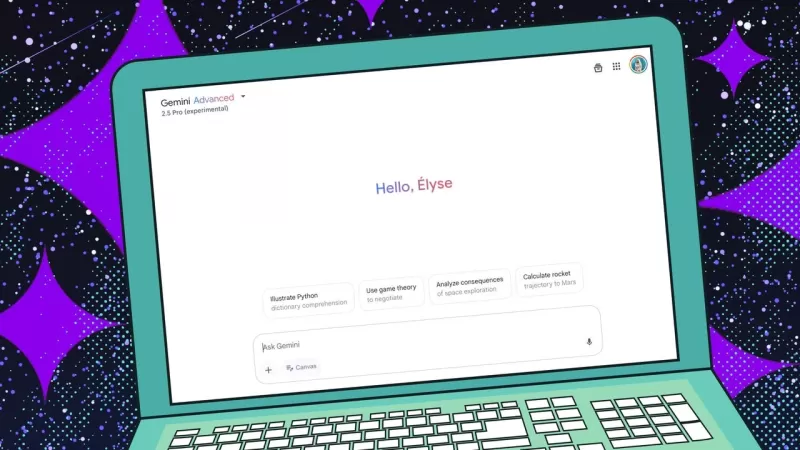 Try Gemini 2.5 Pro for Free Now Available to Everyone
Just when you thought the AI race couldn't get any more intense, Google has thrown another contender into the ring. Last Tuesday, they unveiled Gemini 2.5, touting it as their "most intelligent" model yet. The initial release? An experimental version of 2.5 Pro that's apparently leading the pack on
Try Gemini 2.5 Pro for Free Now Available to Everyone
Just when you thought the AI race couldn't get any more intense, Google has thrown another contender into the ring. Last Tuesday, they unveiled Gemini 2.5, touting it as their "most intelligent" model yet. The initial release? An experimental version of 2.5 Pro that's apparently leading the pack on
 Apple Watch Voice Notes Now Effortlessly Transcribed to Reflect
In today's fast-moving world, jotting down thoughts and ideas on the fly is crucial for staying productive. This article will walk you through the steps to connect your Apple Watch with Reflect, a robust note-taking app, using Whisper Memos and Zapier. By setting up this automation, you'll be able t
Apple Watch Voice Notes Now Effortlessly Transcribed to Reflect
In today's fast-moving world, jotting down thoughts and ideas on the fly is crucial for staying productive. This article will walk you through the steps to connect your Apple Watch with Reflect, a robust note-taking app, using Whisper Memos and Zapier. By setting up this automation, you'll be able t
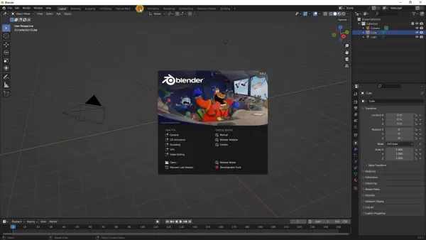 Comprehensive Guide to Mastering AI Image Creation in Blender
Blender, an ever-evolving open-source 3D creation suite, is pushing the boundaries of creativity by integrating Artificial Intelligence (AI) into its workflow. This fusion opens up a world of possibilities for texture and image generation, transforming the way artists approach 3D projects. In this g
Comprehensive Guide to Mastering AI Image Creation in Blender
Blender, an ever-evolving open-source 3D creation suite, is pushing the boundaries of creativity by integrating Artificial Intelligence (AI) into its workflow. This fusion opens up a world of possibilities for texture and image generation, transforming the way artists approach 3D projects. In this g