Home
HomeGoogle Overhauls All App Icons with Gradient Colors, Moving Beyond Flat Design
Google is rolling out a major visual refresh across its app ecosystem. After an initial trial in late 2025, the new gradient icon design has now been confirmed for nearly all of Google's core applications.
Design Language Becomes Softer and More Dynamic
The update moves away from the previous rigid circular shapes and four-color block icons. The new designs feature softer rounded corners, with colors that fade smoothly from light pastels into Google's signature vibrant primary hues, creating a more modern and energetic look.
This shift in design goes beyond aesthetics — it reflects Google's transition into the "AI-first" era. Reports suggest the lively gradient style is meant to showcase the deep integration of AI-driven features like Gemini across the company's apps.
Efficiency Tool Icons Restructured
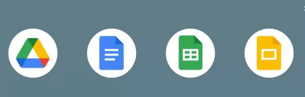
Alongside the color changes, the layout of productivity app icons has also been reworked. Google Docs, Sheets, and Slides have dropped the long-standing "vertical paper" design in favor of a horizontal format that fits better with modern screens, resulting in a more balanced visual appearance.
Notably, some icons revisit classic elements. For example, the Google Chat icon now features a green smiley face reminiscent of the Hangouts era, replacing the earlier four-color bubble border. This mix of nostalgia and innovation is expected to improve user recognition when switching between multiple apps.
Related article
 Zhiyuan WITA Ends 'Naked' Robot Interaction with First Compliance Filing
The embodied intelligence sector has reached a significant milestone. According to the latest announcement from the Shanghai Cyberspace Administration, the WITA large model developed by Zhiyuan has successfully completed the filing process, becoming
Anthropic Study Links Polished AI Content to Reduced Human Thinking
When you see AI instantly produce a well-structured, logically clear piece of code or document, are you tempted to trust it without a second thought? According to AIbase, the leading AI company Anthropic recently published a research report titled "A
UK Government Departments Clash Over Energy Needs for AI Data Centers
The UK government is grappling with a major challenge: advancing clean energy while aiming to become a global leader in artificial intelligence. Yet serious inconsistencies appear between the departments responsible for these goals. The Department fo
Related Special Topic Recommendations
Comic Creation
Zhiyuan WITA Ends 'Naked' Robot Interaction with First Compliance Filing
The embodied intelligence sector has reached a significant milestone. According to the latest announcement from the Shanghai Cyberspace Administration, the WITA large model developed by Zhiyuan has successfully completed the filing process, becoming
Anthropic Study Links Polished AI Content to Reduced Human Thinking
When you see AI instantly produce a well-structured, logically clear piece of code or document, are you tempted to trust it without a second thought? According to AIbase, the leading AI company Anthropic recently published a research report titled "A
UK Government Departments Clash Over Energy Needs for AI Data Centers
The UK government is grappling with a major challenge: advancing clean energy while aiming to become a global leader in artificial intelligence. Yet serious inconsistencies appear between the departments responsible for these goals. The Department fo
Related Special Topic Recommendations
Comic Creation
 Top AI Auto-Colorization Tools for Manga: Apply Flat Colors with Zero Consistency Errors
Discover the 2026 best AI auto-colorization tools for manga at XIX.AI. Our curated list features top-rated, game-changing solutions that apply flat colors with zero consistency errors, boosting your productivity. Explore free vs paid comparisons, real-world tests, and weekly updated rankings to find your perfect match. Unlock your AI edge today.
 10 tools
 xix.ai
writing
Top AI Fiction Profile Creators: Generate Consistent Character Motivations and Fatal Flaws
xix.ai
writing
Top AI Fiction Profile Creators: Generate Consistent Character Motivations and Fatal Flaws
Discover the 2026 best AI fiction profile creators for crafting deep characters. XIX.AI's curated list features top-rated, game-changing tools that generate consistent motivations and fatal flaws. Compare free vs paid options with real-world tests. Unlock your storytelling potential now.
10 tools
xix.ai
Business
Top AI Pricing Optimization Software: Track Competitors & Auto-Adjust Store Prices
Discover the 2026 best AI pricing optimization software on XIX.AI. Our curated list features top-rated, game-changing tools that track competitors and auto-adjust your store prices for maximum profit. Compare free vs paid options with real-world tests. Unlock your pricing edge now.
10 tools
xix.ai
code
Best AI Code Reviewers: Automate Clean Code Compliance & Refactor Legacy Repo Files
Discover the 2026 best AI code reviewers on XIX.AI. Our curated list features top-rated, game-changing tools for automating clean code compliance and refactoring legacy repo files. Compare free vs paid options with real-world tests and weekly updated rankings. Unlock your AI edge today.
10 tools
xix.ai
Text-to-speech
Top AI TTS Apps for Dyslexia: Support Learning and Reading Efficiency for Students
Discover the 2026 latest top-rated AI TTS apps curated for dyslexia support. Our expert rankings compare free vs paid tools, highlighting powerful features for enhanced reading efficiency and learning. Explore must-try, game-changing solutions to unlock student potential. Start your journey at XIX.AI.
10 tools
xix.ai
Comic Creation
Top AI Generators for Shonen Manga: Create High-Octane Action Sequences & Energy Effects
Discover the 2026 best AI generators for Shonen manga at XIX.AI. Our top-rated, curated list features powerful tools for creating high-octane action sequences and dynamic energy effects. Compare free vs paid options with real-world tests. Unlock your creative potential and start crafting epic manga today!
15 tools
xix.ai

 Comments (0)
0/500
Comments (0)
0/500
Google is rolling out a major visual refresh across its app ecosystem. After an initial trial in late 2025, the new gradient icon design has now been confirmed for nearly all of Google's core applications.
Design Language Becomes Softer and More Dynamic
The update moves away from the previous rigid circular shapes and four-color block icons. The new designs feature softer rounded corners, with colors that fade smoothly from light pastels into Google's signature vibrant primary hues, creating a more modern and energetic look.
This shift in design goes beyond aesthetics — it reflects Google's transition into the "AI-first" era. Reports suggest the lively gradient style is meant to showcase the deep integration of AI-driven features like Gemini across the company's apps.
Efficiency Tool Icons Restructured
Alongside the color changes, the layout of productivity app icons has also been reworked. Google Docs, Sheets, and Slides have dropped the long-standing "vertical paper" design in favor of a horizontal format that fits better with modern screens, resulting in a more balanced visual appearance.
Notably, some icons revisit classic elements. For example, the Google Chat icon now features a green smiley face reminiscent of the Hangouts era, replacing the earlier four-color bubble border. This mix of nostalgia and innovation is expected to improve user recognition when switching between multiple apps.


 Zhiyuan WITA Ends 'Naked' Robot Interaction with First Compliance Filing
The embodied intelligence sector has reached a significant milestone. According to the latest announcement from the Shanghai Cyberspace Administration, the WITA large model developed by Zhiyuan has successfully completed the filing process, becoming
Zhiyuan WITA Ends 'Naked' Robot Interaction with First Compliance Filing
The embodied intelligence sector has reached a significant milestone. According to the latest announcement from the Shanghai Cyberspace Administration, the WITA large model developed by Zhiyuan has successfully completed the filing process, becoming
 Anthropic Study Links Polished AI Content to Reduced Human Thinking
When you see AI instantly produce a well-structured, logically clear piece of code or document, are you tempted to trust it without a second thought? According to AIbase, the leading AI company Anthropic recently published a research report titled "A
Anthropic Study Links Polished AI Content to Reduced Human Thinking
When you see AI instantly produce a well-structured, logically clear piece of code or document, are you tempted to trust it without a second thought? According to AIbase, the leading AI company Anthropic recently published a research report titled "A
 UK Government Departments Clash Over Energy Needs for AI Data Centers
The UK government is grappling with a major challenge: advancing clean energy while aiming to become a global leader in artificial intelligence. Yet serious inconsistencies appear between the departments responsible for these goals. The Department fo
UK Government Departments Clash Over Energy Needs for AI Data Centers
The UK government is grappling with a major challenge: advancing clean energy while aiming to become a global leader in artificial intelligence. Yet serious inconsistencies appear between the departments responsible for these goals. The Department fo
Discover the 2026 best AI auto-colorization tools for manga at XIX.AI. Our curated list features top-rated, game-changing solutions that apply flat colors with zero consistency errors, boosting your productivity. Explore free vs paid comparisons, real-world tests, and weekly updated rankings to find your perfect match. Unlock your AI edge today.
10 tools
xix.ai
Discover the 2026 best AI fiction profile creators for crafting deep characters. XIX.AI's curated list features top-rated, game-changing tools that generate consistent motivations and fatal flaws. Compare free vs paid options with real-world tests. Unlock your storytelling potential now.
10 tools
xix.ai
Discover the 2026 best AI pricing optimization software on XIX.AI. Our curated list features top-rated, game-changing tools that track competitors and auto-adjust your store prices for maximum profit. Compare free vs paid options with real-world tests. Unlock your pricing edge now.
10 tools
xix.ai
Discover the 2026 best AI code reviewers on XIX.AI. Our curated list features top-rated, game-changing tools for automating clean code compliance and refactoring legacy repo files. Compare free vs paid options with real-world tests and weekly updated rankings. Unlock your AI edge today.
10 tools
xix.ai
Discover the 2026 latest top-rated AI TTS apps curated for dyslexia support. Our expert rankings compare free vs paid tools, highlighting powerful features for enhanced reading efficiency and learning. Explore must-try, game-changing solutions to unlock student potential. Start your journey at XIX.AI.
10 tools
xix.ai
Discover the 2026 best AI generators for Shonen manga at XIX.AI. Our top-rated, curated list features powerful tools for creating high-octane action sequences and dynamic energy effects. Compare free vs paid options with real-world tests. Unlock your creative potential and start crafting epic manga today!
15 tools
xix.ai