Design a Stunning Timeline Infographic Using Adobe Illustrator

 April 26, 2025

 JerryLopez

 7
7
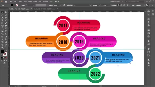
Infographics are a fantastic way to present complex information in an engaging, easy-to-digest format. Among them, timeline infographics are particularly effective for showcasing events, progress, or milestones over time. This guide will walk you through creating a sleek, professional 6-step timeline infographic using Adobe Illustrator. We'll cover the essential techniques, best practices, and creative elements that will make your infographic stand out and captivate your audience. Whether you're a seasoned designer or just starting out, you'll find valuable insights and practical tips here to boost your infographic design skills.
Key Points
- Learn how to set up your Adobe Illustrator workspace for infographic design.
- Master the creation of basic shapes like circles and rounded rectangles.
- Discover how to use the Pathfinder tool to create unique graphic elements.
- Apply color gradients to enhance the visual appeal of your infographic.
- Understand the importance of proper alignment and spacing in infographic design.
- Learn to incorporate text and headings effectively to convey information.
- Create a visually engaging 6-step timeline layout.
Setting Up Your Adobe Illustrator Workspace
Enabling Rulers and Creating Guides
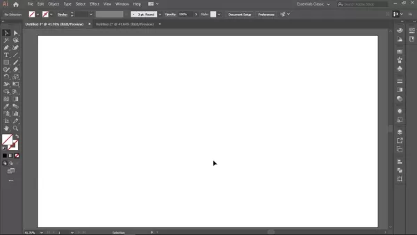
Before you dive into the design process, setting up your workspace in Adobe Illustrator is key for precision and organization. Start by enabling the rulers (View > Rulers > Show Rulers). These help you measure and position elements accurately on your artboard. Next, drag guides from the rulers onto your artboard, aligning them both horizontally and vertically at the center. Once you've got your guides in place, lock them (Right-click > Lock Guides) to keep them from shifting around as you work. This setup is crucial for creating a clean and structured infographic, laying the groundwork for your visual storytelling.
Creating the Base Circle
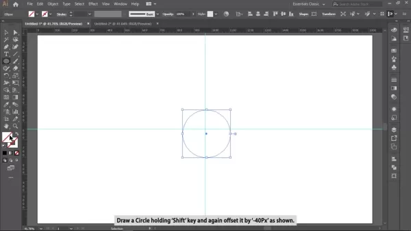
The base circle forms the foundation of your timeline's visual structure. Grab the Ellipse Tool (L) from the toolbar. Hold down the Shift key to draw a perfect circle from the center point where your guides intersect. Choose a dark shade like black or deep gray for the fill color to anchor your design visually. After drawing the circle, offset the path inward by -40px (Object > Path > Offset Path). This inner circle will help you create a compelling ring structure, setting the stage for an elegant and clear design.
Subtracting Circles to Create the Timeline Ring
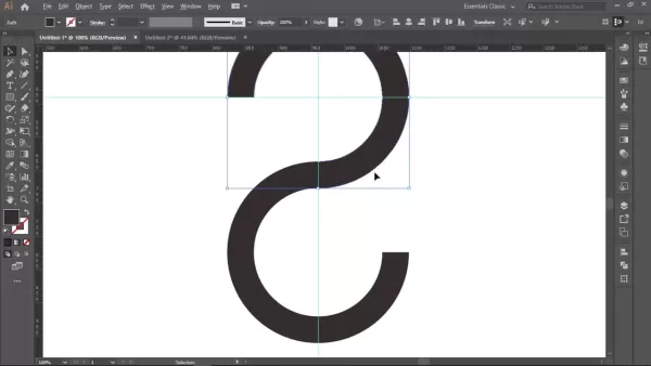
With both circles drawn, you'll create a distinct ring that'll be the core of your timeline. Select both the outer and inner circles and open the Pathfinder panel (Window > Pathfinder). Click on the Subtract Front option to carve out the inner circle from the outer one, leaving you with a clean ring shape. This ring is perfect for adding timeline steps and connecting elements, ensuring your design remains tidy and well-structured.
Creating the Timeline Segments
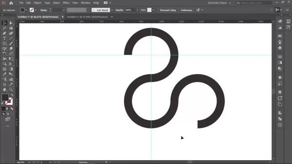
To segment the ring into distinct timeline parts, use the Rectangle Tool (M) to draw a rectangle that covers about 25% of the circle. Don't worry about precision just yet; we'll adjust it later. This rectangle will subtract from the circle, creating the first segment. Select both the ring and rectangle, then use the Pathfinder panel again, clicking Subtract Front. Use Alt+Drag to duplicate and transform this segment, and create three more duplicates. With the Rotate Tool (R), rotate each segment by 90 degrees to form four equal parts. Precise rotation ensures your graphic elements are correctly placed.
Building the Timeline Structure
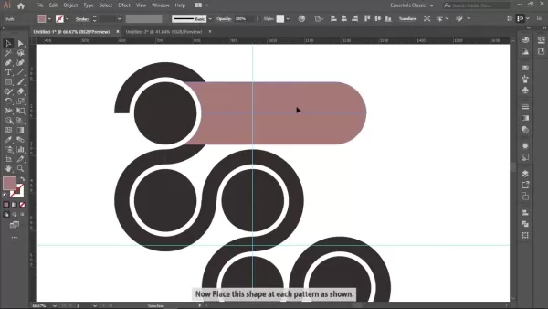
Now that you've got your timeline components, it's time to arrange them into the infographic's structure. Draw a circle at the center of each segment. Select all main shapes and use Minus Front in the Pathfinder to combine them. Round off one edge of a rectangle to give it a curved design. Make sure the rectangle's height matches the circle's diameter. Use Alt+Drag to duplicate and reflect vertically, creating each step of the infographic.
Creating a Visually Appealing Timeline
Applying Color Gradients
To give your infographic a modern and eye-catching look, use color gradients. Select each shape and apply a gradient fill. Experiment with different color combinations that fit your infographic's theme and content. Consider using analogous colors for a harmonious effect or complementary colors for contrast and visual interest. A well-chosen color palette will make your infographic pop. Balancing colors can enhance visual communication.
Adding Text and Headings
Include clear and concise text to guide viewers through your timeline. Choose appropriate font sizes and styles for readability. Add headings for each step to provide context and clarity. Use bold text or different font weights to highlight key points. Ensure your text is well-aligned and spaced within each segment, maintaining a professional look. Good typography aids clarity.
Finishing Touches
To create a stunning background, use gradients and radial fills, as seen in the original. Once these are in place, make sure all shapes are perfectly aligned, ready for deployment. A polished infographic leaves a lasting impression and enhances its effectiveness.
Pros and Cons of Using Adobe Illustrator for Infographics
Pros
- Precise Vector Graphics: Illustrator offers unparalleled control over vector graphics, ensuring crisp, scalable visuals at any size.
- Powerful Design Tools: It provides a comprehensive suite of tools, including advanced shape creation, Pathfinder operations, and gradient control.
- Seamless Text Integration: Illustrator allows for seamless integration of text and graphics, making your infographic both visually appealing and informative.
- Excellent Typography Control: It offers incredible typography controls, allowing for precise font styling.
- Industry Standard: As an industry-standard tool, Illustrator is widely supported and comes with abundant online resources, tutorials, and community support.
Cons
- Steep Learning Curve: Illustrator's extensive features and complex interface can be daunting for beginners.
- Subscription Cost: It's a subscription-based software, which might be a barrier for some users.
- Resource-Intensive: Illustrator can be demanding on system resources, especially with large or complex infographics.
- Not Ideal for Data Visualization: While it can create basic charts and graphs, it's not as specialized for data visualization as tools like Tableau or dedicated charting libraries.
FAQ
What software do I need to create this infographic?
This tutorial is tailored for Adobe Illustrator, a professional vector graphics editor widely used for creating infographics, illustrations, and other design assets. While the core concepts might be adaptable to other vector graphics software, the specific tools and techniques here are designed for Illustrator's interface and capabilities.
Can I use these techniques to create other types of infographics?
Absolutely! The skills you learn here – shape creation, Pathfinder operations, color gradient application, and text integration – are fundamental and can be applied to various infographic types. Feel free to experiment with different layouts, data visualizations, and design elements to create infographics tailored to your needs.
How can I ensure my infographic is accessible to people with visual impairments?
Accessibility is crucial. Use sufficient color contrast between text and background, provide alt text descriptions for images and icons, and ensure your infographic's structure is logical and easy to navigate for screen readers. By considering accessibility, you can make your infographic inclusive and impactful for a wider audience.
Can I change the layout?
The six-step timeline described here is just one example. It can be adapted to a vertical format, and you can easily modify it to create 8 or 10-step timelines for different graphic elements.
Related Questions
What are some tips for choosing the right colors for my infographic?
Color selection is crucial for your infographic's visual impact and meaning. Consider these tips:
- Understand Color Psychology: Different colors evoke different emotions and associations. Research color psychology to choose colors that align with your infographic's message and target audience.
- Establish a Color Palette: Limit your color palette to a few carefully selected colors for visual consistency. Use color tools or online resources to generate harmonious color schemes.
- Consider Contrast: Ensure sufficient contrast between text and background colors for readability. Avoid using colors that are too similar in value.
- Use Color to Highlight Data: Use color strategically to draw attention to key data points or trends. Use brighter or more saturated colors for important information and more muted colors for supporting details.
- Test Your Color Choices: Before finalizing your design, test your color choices with different audiences to ensure they effectively convey your message.
How can I make my infographic more engaging and shareable?
A well-designed infographic not only presents information effectively but also encourages engagement and sharing. Here are some strategies:
- Tell a Story: Craft a compelling narrative that guides the viewer through the data in a logical and engaging way. Use visual elements to illustrate key points and create a memorable experience.
- Keep it Concise: Focus on essential information and avoid overwhelming the viewer with too much detail. Condense your content into easily digestible chunks.
- Use High-Quality Visuals: Incorporate compelling visuals, such as icons, illustrations, and charts, to enhance the visual appeal and clarity of your infographic.
- Optimize for Social Sharing: Include social sharing buttons to make it easy for viewers to share your infographic on social media platforms.
- Design for Mobile: Ensure your infographic is responsive and adapts well to different screen sizes, particularly mobile devices. A great mobile experience leads to higher click rates.
What are some common mistakes to avoid when designing infographics?
Designing effective infographics requires careful planning. Here are some common pitfalls to avoid:
- Data Overload: Avoid cramming too much information into a single infographic. Focus on the most essential data points and present them clearly and concisely.
- Poor Visual Hierarchy: Establish a clear visual hierarchy to guide the viewer's eye through the infographic in a logical sequence. Use headings, subheadings, and visual cues to emphasize important information.
- Inconsistent Design: Maintain a consistent design style throughout your infographic, including font choices, color palette, and visual elements. Inconsistency can detract from the overall effectiveness and credibility of your design.
- Lack of Data Verification: Ensure all data presented in your infographic is accurate and verified from reliable sources. Presenting inaccurate information can damage your credibility and undermine the effectiveness of your message.
- Ignoring Accessibility: Neglecting accessibility considerations can exclude a significant portion of your audience. Ensure your infographic is accessible to people with visual impairments by using sufficient color contrast, providing alt text descriptions, and structuring your content logically.
Related article
 Maximize Shopify Sales Using Lookfor's AI-Powered Shopping Assistant
Revolutionizing Shopify Stores with AI-Powered AssistanceIn the bustling world of e-commerce, standing out with top-notch customer service and personalized shopping experiences is more important than ever. Enter Lookfor's AI shopping assistant, a game-changer for Shopify stores. This tool is designe
Top 3 Lucrative Side Hustles to Launch Now Using OpenAI's Sora Video Generator
My Thoughts on Fancy New AI Features
Every time a company rolls out a new AI feature, I can't help but think to myself, "Wow, I can snap a photo of sushi, turn it into a dancing cartoon character with just one prompt." Truly groundbreaking, right? Sarcasm aside, I've got to admit, OpenAI Sora is pre
AI's Potential to Replace Software Engineers: Opinions Vary
AI's Rising Role in Software Engineering: A New Frontier
Artificial Intelligence (AI) is on the cusp of transforming the role of software engineers, according to industry experts. Sarah Friar, Chief Financial Officer at OpenAI, highlighted this shift at a recent Goldman Sachs conference, introducin
Comments (0)
0/200
Maximize Shopify Sales Using Lookfor's AI-Powered Shopping Assistant
Revolutionizing Shopify Stores with AI-Powered AssistanceIn the bustling world of e-commerce, standing out with top-notch customer service and personalized shopping experiences is more important than ever. Enter Lookfor's AI shopping assistant, a game-changer for Shopify stores. This tool is designe
Top 3 Lucrative Side Hustles to Launch Now Using OpenAI's Sora Video Generator
My Thoughts on Fancy New AI Features
Every time a company rolls out a new AI feature, I can't help but think to myself, "Wow, I can snap a photo of sushi, turn it into a dancing cartoon character with just one prompt." Truly groundbreaking, right? Sarcasm aside, I've got to admit, OpenAI Sora is pre
AI's Potential to Replace Software Engineers: Opinions Vary
AI's Rising Role in Software Engineering: A New Frontier
Artificial Intelligence (AI) is on the cusp of transforming the role of software engineers, according to industry experts. Sarah Friar, Chief Financial Officer at OpenAI, highlighted this shift at a recent Goldman Sachs conference, introducin
Comments (0)
0/200
April 26, 2025
JerryLopez
7
Infographics are a fantastic way to present complex information in an engaging, easy-to-digest format. Among them, timeline infographics are particularly effective for showcasing events, progress, or milestones over time. This guide will walk you through creating a sleek, professional 6-step timeline infographic using Adobe Illustrator. We'll cover the essential techniques, best practices, and creative elements that will make your infographic stand out and captivate your audience. Whether you're a seasoned designer or just starting out, you'll find valuable insights and practical tips here to boost your infographic design skills.
Key Points
- Learn how to set up your Adobe Illustrator workspace for infographic design.
- Master the creation of basic shapes like circles and rounded rectangles.
- Discover how to use the Pathfinder tool to create unique graphic elements.
- Apply color gradients to enhance the visual appeal of your infographic.
- Understand the importance of proper alignment and spacing in infographic design.
- Learn to incorporate text and headings effectively to convey information.
- Create a visually engaging 6-step timeline layout.
Setting Up Your Adobe Illustrator Workspace
Enabling Rulers and Creating Guides
Before you dive into the design process, setting up your workspace in Adobe Illustrator is key for precision and organization. Start by enabling the rulers (View > Rulers > Show Rulers). These help you measure and position elements accurately on your artboard. Next, drag guides from the rulers onto your artboard, aligning them both horizontally and vertically at the center. Once you've got your guides in place, lock them (Right-click > Lock Guides) to keep them from shifting around as you work. This setup is crucial for creating a clean and structured infographic, laying the groundwork for your visual storytelling.
Creating the Base Circle
The base circle forms the foundation of your timeline's visual structure. Grab the Ellipse Tool (L) from the toolbar. Hold down the Shift key to draw a perfect circle from the center point where your guides intersect. Choose a dark shade like black or deep gray for the fill color to anchor your design visually. After drawing the circle, offset the path inward by -40px (Object > Path > Offset Path). This inner circle will help you create a compelling ring structure, setting the stage for an elegant and clear design.
Subtracting Circles to Create the Timeline Ring
With both circles drawn, you'll create a distinct ring that'll be the core of your timeline. Select both the outer and inner circles and open the Pathfinder panel (Window > Pathfinder). Click on the Subtract Front option to carve out the inner circle from the outer one, leaving you with a clean ring shape. This ring is perfect for adding timeline steps and connecting elements, ensuring your design remains tidy and well-structured.
Creating the Timeline Segments
To segment the ring into distinct timeline parts, use the Rectangle Tool (M) to draw a rectangle that covers about 25% of the circle. Don't worry about precision just yet; we'll adjust it later. This rectangle will subtract from the circle, creating the first segment. Select both the ring and rectangle, then use the Pathfinder panel again, clicking Subtract Front. Use Alt+Drag to duplicate and transform this segment, and create three more duplicates. With the Rotate Tool (R), rotate each segment by 90 degrees to form four equal parts. Precise rotation ensures your graphic elements are correctly placed.
Building the Timeline Structure
Now that you've got your timeline components, it's time to arrange them into the infographic's structure. Draw a circle at the center of each segment. Select all main shapes and use Minus Front in the Pathfinder to combine them. Round off one edge of a rectangle to give it a curved design. Make sure the rectangle's height matches the circle's diameter. Use Alt+Drag to duplicate and reflect vertically, creating each step of the infographic.
Creating a Visually Appealing Timeline
Applying Color Gradients
To give your infographic a modern and eye-catching look, use color gradients. Select each shape and apply a gradient fill. Experiment with different color combinations that fit your infographic's theme and content. Consider using analogous colors for a harmonious effect or complementary colors for contrast and visual interest. A well-chosen color palette will make your infographic pop. Balancing colors can enhance visual communication.
Adding Text and Headings
Include clear and concise text to guide viewers through your timeline. Choose appropriate font sizes and styles for readability. Add headings for each step to provide context and clarity. Use bold text or different font weights to highlight key points. Ensure your text is well-aligned and spaced within each segment, maintaining a professional look. Good typography aids clarity.
Finishing Touches
To create a stunning background, use gradients and radial fills, as seen in the original. Once these are in place, make sure all shapes are perfectly aligned, ready for deployment. A polished infographic leaves a lasting impression and enhances its effectiveness.
Pros and Cons of Using Adobe Illustrator for Infographics
Pros
- Precise Vector Graphics: Illustrator offers unparalleled control over vector graphics, ensuring crisp, scalable visuals at any size.
- Powerful Design Tools: It provides a comprehensive suite of tools, including advanced shape creation, Pathfinder operations, and gradient control.
- Seamless Text Integration: Illustrator allows for seamless integration of text and graphics, making your infographic both visually appealing and informative.
- Excellent Typography Control: It offers incredible typography controls, allowing for precise font styling.
- Industry Standard: As an industry-standard tool, Illustrator is widely supported and comes with abundant online resources, tutorials, and community support.
Cons
- Steep Learning Curve: Illustrator's extensive features and complex interface can be daunting for beginners.
- Subscription Cost: It's a subscription-based software, which might be a barrier for some users.
- Resource-Intensive: Illustrator can be demanding on system resources, especially with large or complex infographics.
- Not Ideal for Data Visualization: While it can create basic charts and graphs, it's not as specialized for data visualization as tools like Tableau or dedicated charting libraries.
FAQ
What software do I need to create this infographic?
This tutorial is tailored for Adobe Illustrator, a professional vector graphics editor widely used for creating infographics, illustrations, and other design assets. While the core concepts might be adaptable to other vector graphics software, the specific tools and techniques here are designed for Illustrator's interface and capabilities.
Can I use these techniques to create other types of infographics?
Absolutely! The skills you learn here – shape creation, Pathfinder operations, color gradient application, and text integration – are fundamental and can be applied to various infographic types. Feel free to experiment with different layouts, data visualizations, and design elements to create infographics tailored to your needs.
How can I ensure my infographic is accessible to people with visual impairments?
Accessibility is crucial. Use sufficient color contrast between text and background, provide alt text descriptions for images and icons, and ensure your infographic's structure is logical and easy to navigate for screen readers. By considering accessibility, you can make your infographic inclusive and impactful for a wider audience.
Can I change the layout?
The six-step timeline described here is just one example. It can be adapted to a vertical format, and you can easily modify it to create 8 or 10-step timelines for different graphic elements.
Related Questions
What are some tips for choosing the right colors for my infographic?
Color selection is crucial for your infographic's visual impact and meaning. Consider these tips:
- Understand Color Psychology: Different colors evoke different emotions and associations. Research color psychology to choose colors that align with your infographic's message and target audience.
- Establish a Color Palette: Limit your color palette to a few carefully selected colors for visual consistency. Use color tools or online resources to generate harmonious color schemes.
- Consider Contrast: Ensure sufficient contrast between text and background colors for readability. Avoid using colors that are too similar in value.
- Use Color to Highlight Data: Use color strategically to draw attention to key data points or trends. Use brighter or more saturated colors for important information and more muted colors for supporting details.
- Test Your Color Choices: Before finalizing your design, test your color choices with different audiences to ensure they effectively convey your message.
How can I make my infographic more engaging and shareable?
A well-designed infographic not only presents information effectively but also encourages engagement and sharing. Here are some strategies:
- Tell a Story: Craft a compelling narrative that guides the viewer through the data in a logical and engaging way. Use visual elements to illustrate key points and create a memorable experience.
- Keep it Concise: Focus on essential information and avoid overwhelming the viewer with too much detail. Condense your content into easily digestible chunks.
- Use High-Quality Visuals: Incorporate compelling visuals, such as icons, illustrations, and charts, to enhance the visual appeal and clarity of your infographic.
- Optimize for Social Sharing: Include social sharing buttons to make it easy for viewers to share your infographic on social media platforms.
- Design for Mobile: Ensure your infographic is responsive and adapts well to different screen sizes, particularly mobile devices. A great mobile experience leads to higher click rates.
What are some common mistakes to avoid when designing infographics?
Designing effective infographics requires careful planning. Here are some common pitfalls to avoid:
- Data Overload: Avoid cramming too much information into a single infographic. Focus on the most essential data points and present them clearly and concisely.
- Poor Visual Hierarchy: Establish a clear visual hierarchy to guide the viewer's eye through the infographic in a logical sequence. Use headings, subheadings, and visual cues to emphasize important information.
- Inconsistent Design: Maintain a consistent design style throughout your infographic, including font choices, color palette, and visual elements. Inconsistency can detract from the overall effectiveness and credibility of your design.
- Lack of Data Verification: Ensure all data presented in your infographic is accurate and verified from reliable sources. Presenting inaccurate information can damage your credibility and undermine the effectiveness of your message.
- Ignoring Accessibility: Neglecting accessibility considerations can exclude a significant portion of your audience. Ensure your infographic is accessible to people with visual impairments by using sufficient color contrast, providing alt text descriptions, and structuring your content logically.


 Maximize Shopify Sales Using Lookfor's AI-Powered Shopping Assistant
Revolutionizing Shopify Stores with AI-Powered AssistanceIn the bustling world of e-commerce, standing out with top-notch customer service and personalized shopping experiences is more important than ever. Enter Lookfor's AI shopping assistant, a game-changer for Shopify stores. This tool is designe
Maximize Shopify Sales Using Lookfor's AI-Powered Shopping Assistant
Revolutionizing Shopify Stores with AI-Powered AssistanceIn the bustling world of e-commerce, standing out with top-notch customer service and personalized shopping experiences is more important than ever. Enter Lookfor's AI shopping assistant, a game-changer for Shopify stores. This tool is designe
 Top 3 Lucrative Side Hustles to Launch Now Using OpenAI's Sora Video Generator
My Thoughts on Fancy New AI Features
Every time a company rolls out a new AI feature, I can't help but think to myself, "Wow, I can snap a photo of sushi, turn it into a dancing cartoon character with just one prompt." Truly groundbreaking, right? Sarcasm aside, I've got to admit, OpenAI Sora is pre
Top 3 Lucrative Side Hustles to Launch Now Using OpenAI's Sora Video Generator
My Thoughts on Fancy New AI Features
Every time a company rolls out a new AI feature, I can't help but think to myself, "Wow, I can snap a photo of sushi, turn it into a dancing cartoon character with just one prompt." Truly groundbreaking, right? Sarcasm aside, I've got to admit, OpenAI Sora is pre
 AI's Potential to Replace Software Engineers: Opinions Vary
AI's Rising Role in Software Engineering: A New Frontier
Artificial Intelligence (AI) is on the cusp of transforming the role of software engineers, according to industry experts. Sarah Friar, Chief Financial Officer at OpenAI, highlighted this shift at a recent Goldman Sachs conference, introducin
AI's Potential to Replace Software Engineers: Opinions Vary
AI's Rising Role in Software Engineering: A New Frontier
Artificial Intelligence (AI) is on the cusp of transforming the role of software engineers, according to industry experts. Sarah Friar, Chief Financial Officer at OpenAI, highlighted this shift at a recent Goldman Sachs conference, introducin