


 首页
首页

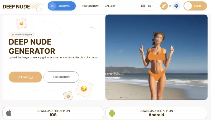
是否曾经偶然发现了AI驱动的图像操纵的有趣世界?如果是这样,您可能已经听说过DeepNude Generator。此工具可让您上传照片,只需单击几下,它就可以从中创建一个逼真的裸照。就像麦基
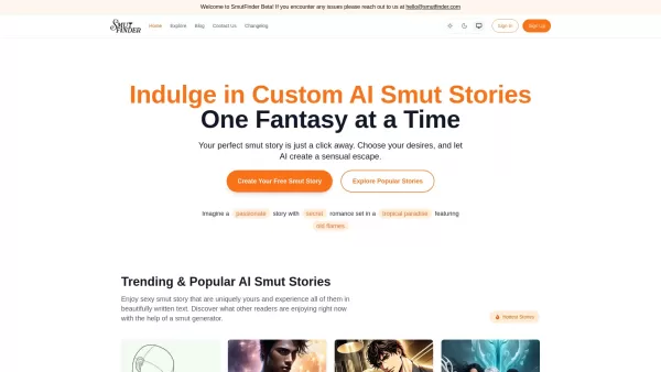
你是否曾经想过进入一个专为你幻想定制的世界?让我向你介绍Smutfinder——一个通过人工智能魔法让你最疯狂的梦想成真的平台。这就像有一个个人讲故事的人,他确切地知道你想要什么,创作出触动你心弦的小黄书故事。\n\n如何进入Smutfinder?\n---------------\n\n在Smutfinder上起步轻而易举。首先,挑选出让你感兴趣的东西——也就是你的欲望。然后,你将成为创作者,自定义角色和场景来构建完美的场景。一旦你布置好了舞台,按下生成按钮,voila!你的个性化故事已经准备
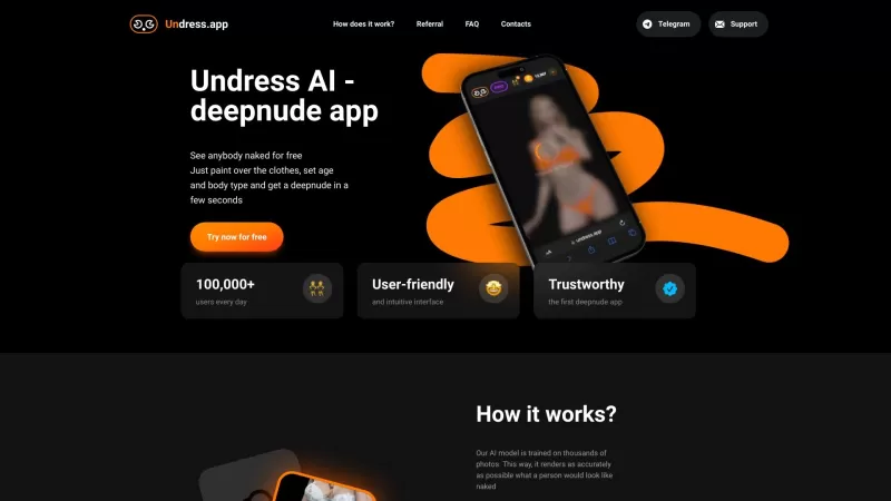
有没有想过在面料下面有什么?好吧,脱衣服AI承诺会通过其深努技术为您提供窥视。这就像让您触手可及的数字艺术家准备创建那些“如果”场景,而没有任何麻烦。该工具是
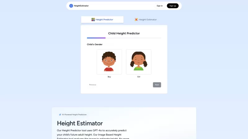
有没有想过你的小家伙会长大多高?还是您对自己的身高潜力感到好奇?输入高度估计器,这是一个可帮助您的Nifty AI工具。这不仅是任何工具;它使用尖端的GPT-4 Vision API
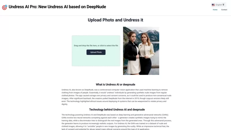
脱衣服AI Pro(通常称为DeepNude)是一种极具争议的工具,引起了辩论。它使用复杂的机器学习算法来数字地从人的图像中删除衣服。这是一个狂野的概念,不是吗?但是le
D&AVIZ产品信息
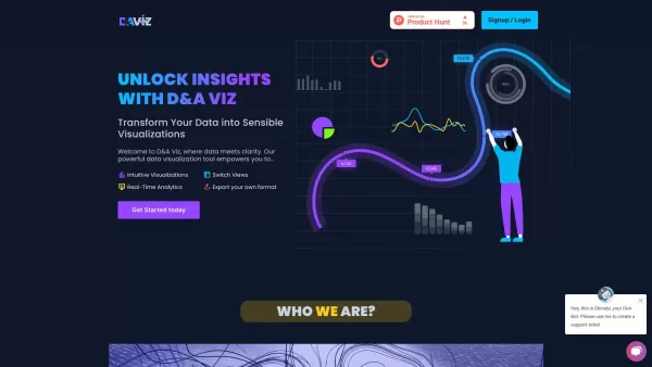
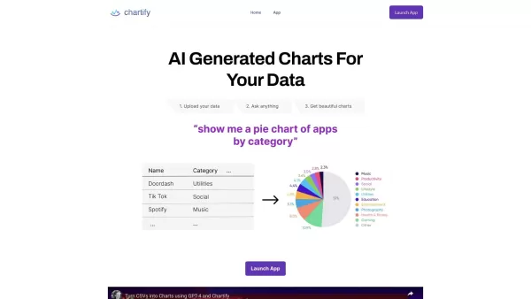
Ever wondered how to turn those heaps of data into something visually appealing and easy to understand? Well, let me introduce you to D&AVIZ, an AI-powered tool that's like magic for your spreadsheets. It's all about transforming raw, boring data into vibrant, informative visuals that not only look good but also help you make better decisions. Think of it as your personal data artist!
How to Use D&AVIZ?
--------------------
Getting started with D&AVIZ is as easy as pie—or should I say, pie chart? Just upload your Excel or CSV files, throw in a query, and watch as D&AVIZ works its magic. Before you know it, you'll have pie charts, donut charts, or linear graphs popping up, turning your complex data into clear, actionable insights. It's like watching a data story unfold right before your eyes!
D&AVIZ's Core Features
--------------------------
Intuitive Visualizations
D&AVIZ doesn't just throw numbers at you; it crafts them into visuals that speak to you. Whether it's a trend you're trying to spot or a pattern you need to understand, D&AVIZ makes it all crystal clear.
Real-Time Analytics
Need to see what's happening right now? D&AVIZ provides real-time analytics, so you're always up to date. It's like having a live feed of your data's heartbeat.
Switch Views
Not satisfied with one view? No problem! Switch between different visualizations with ease. It's like having multiple perspectives on your data at your fingertips.
Export Your Own Format
Once you've got your insights, you can export them in your preferred format. Whether it's for a presentation or a report, D&AVIZ lets you take your visuals with you.
FAQ from D&AVIZ
-------------------
- How do I upload data to D&AVIZ?
- Just drag and drop your Excel or CSV files into the upload section. It's that simple!
- Can I customize the visualizations?
- Absolutely! You can tweak colors, styles, and even the type of chart to fit your needs.
- How can I share my insights?
- Export your visualizations and share them via email, presentations, or any other platform you use.
- What are the benefits of visualizing data?
- Visualizing data helps you spot trends, understand patterns, and make informed decisions quickly and effectively.
- How can I contact D&AVIZ for support?
- Reach out to us via our support email or through the live chat on our website. We're here to help!
And who's behind this awesome tool? None other than Arivu IQ, Corp. They're the masterminds making data visualization a breeze with D&AVIZ.
D&AVIZ截图


探索2026年最新、最受好评的AI伴侣工具,体验沉浸式角色扮演与情感联结。XIX.AI精心编纂的指南汇集了功能强大、颠覆传统的应用程序,提供每周更新的排行榜、免费与付费版本对比,以及真实场景测试。立即找到您的理想伴侣,开启有意义的数字陪伴之旅。
 10 个工具
 xix.ai

探索2026年最优秀的AI助手,助您创作史诗级的仙侠与武侠故事。XIX.AI精心整理的这份清单汇集了广受好评、能彻底改变创作格局的工具,助您驾驭修仙进阶与武术动作设计。通过实际测试对比免费与付费选项。释放您的创作潜能,今天就开始写作吧!
10 个工具
xix.ai

探索2026年最适合Flutter和React Native的最佳AI移动应用开发工具。我们精心挑选的这些高评分工具能够提供强大的功能,帮助您根据提示生成跨平台代码。通过实际测试来对比免费选项和付费选项,让开发更加高效,从而打造出更出色的应用程序。现在就访问XIX.AI查看排名吧!
10 个工具
xix.ai

在 XIX.AI 上探索 2026 年最佳 AI Chrome 扩展程序生成器。我们精心挑选的这份清单汇集了广受好评、不容错过的工具,让您无需编写代码即可创建自定义浏览器插件。对比免费与付费选项,查看实际测试结果,并释放您的工作效率。立即查看最新排行榜,找到最适合您的工具!
10 个工具
xix.ai

探索2026年最优秀的人工智能多语言文本转语音工具,这些工具能够生成50多种语言中具有真实母语口音的语音。查看我们精心挑选的排名榜单,了解免费版本与付费版本的差异,并通过实际测试来验证它们的效果。在XIX.AI上找到最适合你的语音工具,立即开启全球交流的新篇章吧。
10 个工具
xix.ai

探索2026年最新评选出的顶级AI会议自动化工具,让协作变得更智能、更高效。我们精心挑选的这些工具能够有效实现笔记、总结和待办事项的自动化处理。通过实际测试和每周更新的排名,您可以了解免费选项与付费选项的差异。立即访问XIX.AI,发现最适合您需求的工具,提升团队生产力吧。
10 个工具
xix.ai


